After we determined what content needed to be updated, it was time to put our mad design skills to use.
Content first. Design second.
 Do you have an opinion on this? It kind of sounds like a “chicken and the egg” argument: which came first?
When it’s time to create your website, debating the chicken and the egg isn’t going to help you get it done. You have to start somewhere.
Joanna Wiebe gives the rationale for developing content first here.
She says, “When I say that ‘copy leads design,’ what do I mean? Simply that you should first organize your messages (i.e., your copy) on the page, and then let the visual design come in to amplify your messages.”
Bingo.
Figure out your content. Then it’s time to create a design that frames the copy and gives a context for your message.
Hopefully you have been following the story of 8 Signal’s website relaunch. If you missed them, you can read our previous posts about how we knew we needed a new site here and how we updated the content here.
When we built our original site, Ruben and I did 100% of the work ourselves—mostly because there was only the two of us. We just had to make do with the resources we had available.
Because we wanted to hit the ground running, we launched our site quickly. As a result, we didn’t think through every design decision with precision.
When we came back to redesign, we knew we could improve the site user’s experience as well as create a design that enhanced our message.
Now we have three designers on staff, and for the relaunch, we were able to draw on our team’s resources and expertise for our own site. There are three areas we needed to focus on to bring it all together.
1. Flow
 Making sure it flowed well was the highest priority for user experience and for keeping our site on message.
The old site had too much text and not enough visual cues directing visitors to the messages we wanted them to read.
The new site is much more user-friendly and helps people find what they need quickly.
Navigation: We moved the navigation bar from the side of the page and turned it into a fixed navigation at the top of the home page so it follows the user as they scroll. We also simplified the navigation to a few choices.
 Messages: Next we made sure our most important messages were right up front and very clear. Previously you had to keep scrolling to see the three sections describing what we do. By converting our message to vertical columns, all of the information is visible at the same time.
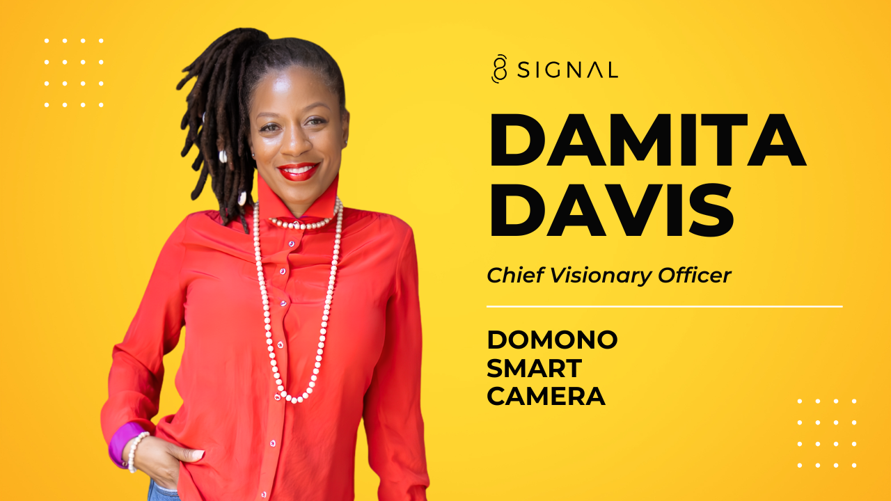
Testimonials: We also made sure our key customer testimonials were front and center, including photos of the customers. This helps people who visit our site connect with the message and adds credibility.
 CTA or Call To Action: Another improvement is in our CTA or “Call To Action” design. On the old site, the CTAs weren’t very clear. They didn’t visually stand out and so it wasn’t obvious what you should do right away when looking at the page. Our new CTAs are front and center and very clearly state what we want the user to do.
In our business, the most important thing is for us to make direct contact with prospects. We want to meet with them one on one, get an idea of what problems they are facing, and find out if we are a good fit. You can see in our updated CTAs that we want our prospects to call or set up a meeting.
That brings us to the important topic of colors in web design.
2. Colors
Not only did we put our CTAs up top, we also gave them a consistent color. Anywhere you see orange on the site, there is a good chance you are looking at a CTA.
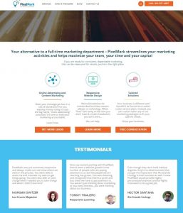
![]() The blue bars indicate you are entering a different area of the homepage so that the information is organized and makes sense to the user.
The blue bars indicate you are entering a different area of the homepage so that the information is organized and makes sense to the user.
Using color to alert the user to take action is a great way to get users to navigate through your site the way you want them to. It can guide them through your site to get the information they want.
We also chose colors that coordinated with our brand identity and brought more visual consistency.
Our original site had an overwhelming amount of blue of all different shades. Our new site brings a lot more balance by simplifying the blue theme and adding the orange call to action color to really guide our site visitor’s eyes to the areas we most want them to click. We also introduced a charcoal grey color to break up the areas of blue without leaving too much white space.
3. Graphics
It was important to us that the new site appeal to people who are driven by visual and print content. Compelling graphics that blend well with the design get people to stay on the site and actually read the content.
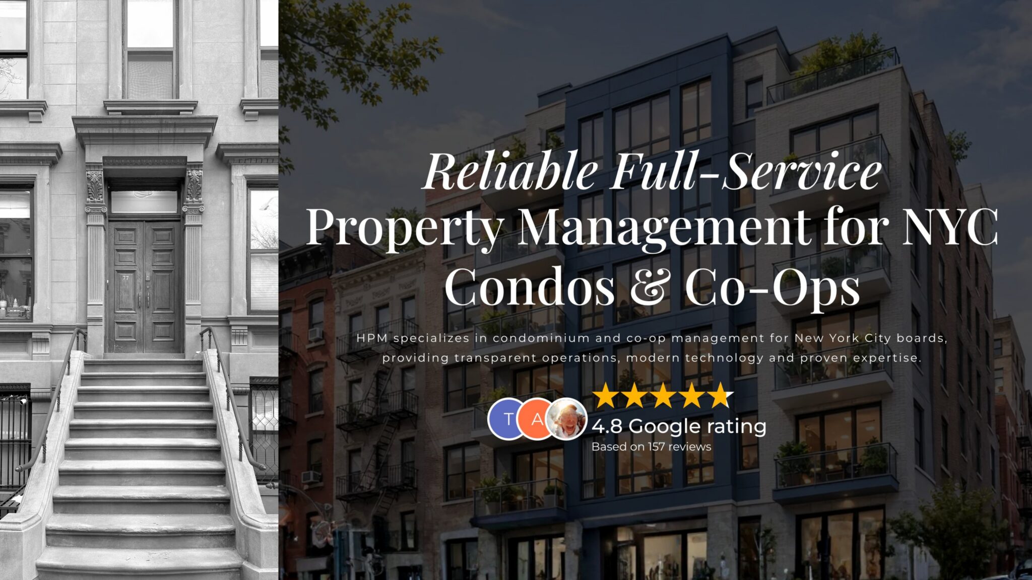
We added a lot of graphics to the new site. We made sure to select photos that were eye-catching and supported the message that we were trying to get across.
On the the original site we had to compromise with the graphics because we didn’t have the technical capacity to create what we really wanted to. We might have had an idea in mind and even had a graphic right in front of us, but we couldn’t make the live site match what we could already see in real time.
We now have dedicated programmers on the team so we rarely have to compromise in the area of graphic design and programming. In fact, we think it is pretty darn good!

We are really proud of what we have created and very happy with all the hard work our team put into 8 Signal’s relaunch.
That being said, we are already thinking about what we want to do the next time we redesign. We are always thinking of ways to improve: how we can draw people to the site and keep them engaged in our content?
Are you ready to give your website a makeover? Or maybe you need to start from scratch. We are here to help. Give us a call at (915) 585-1919 to schedule your first consultation, or fill out our online form. Remember, 8 Signal is your marketing department — without the overhead!
Photos courtesy of ruben alexander.