

The end goal of creating a website is generating leads and conversions. We all know how a website’s user experience has a significant role in helping webmasters achieve this objective.
Research reveals that it only takes 50 milliseconds for users to form an opinion about a website. The first impression is largely based on website speed, navigation, colors, symmetry, content, and the form design. All these, including online forms, are critical aspects of user experience as they help visitors get what they are seeking and make it easy for them to get in touch with you.
UX applies to web forms, with regards to their accessibility, convenience, and ease of use. While forms aren’t necessarily instrumental in engaging users, it surely helps in the process of lead generation. A good form is easy to understand and persuades users to fill in their details. It facilitates a strong connection between the business and its prospects.
Web forms come in various shapes and sizes but mastering form design and weaving them seamlessly across your website can be tricky. WordPress users are lucky to have an extensive library of form plugins that allow them to build awesome-looking and effective forms.
But even if WordPress form plugins are reliable, you shouldn’t leave everything to them. There are several easy and effective tools to create engaging forms that can help you connect with the audience, collect leads, and close sales.
So, before you begin downloading those plugins, let us walk you through some form design best practices all WordPress users can implement to provide better service and grow your customer relationships.
To begin with, here are a few statistics that point to the role of forms in determining business success.
- HubSpot confirms that forms are the most common type of lead generation tool used by SMEs today. 74% of respondents in a survey report using them.
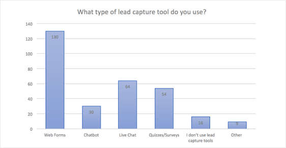
- 68% of B2B businesses use landing pages with personalized lead forms for nurturing leads.
- Using multi-step lead forms in WordPress can fetch businesses 300% conversions.
Thus, forms are becoming an integral part of most business websites. In this age of low attention span, customers are looking for specific messages catered to their needs. Forms help businesses achieve this while helping them establish a relationship with their audience.
Form Design Best Practices for WordPress Users
Forms are omnipresent on websites today, whether it’s being employed for purchasing a product or joining an online forum. But unfortunately, they are often viewed by businesses as an unavoidable evil because form pages experience the maximum drop-offs.
Here are a few design best practices that will help you make the form-filling process more intuitive and effortless for your users.
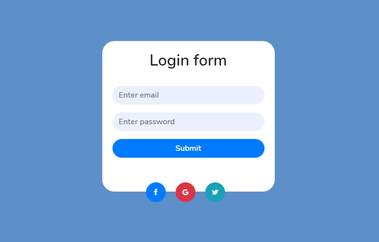
1. Keep It Simple
One of the most common mistakes that webmasters make is to prioritize web design over UX. For instance, flashy web form designs could make your website look stunning but negatively impacts your site’s UX and leads to a compromise of its features.
Make sure your form is simple and easy to navigate. At times, a simple and uniform design can work wonders in improving visitor retention rates. Opt for neat formatting and a uniform layout, allowing you to balance usability and design.
Remember these quick tips when creating a form on your website
a. Only Ask for the Information You Need
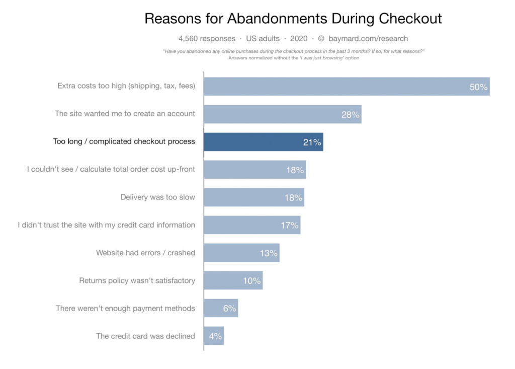
Remember that one of the primary reasons for abandonment is a long and complicated checkout process, which includes lengthy form fields than needed.
What information do you need to allow the user to continue? Can some of the information be collected at a later date? Make sure you prioritize the most critical information needed in the form. This will make your form feel less like an interrogation.
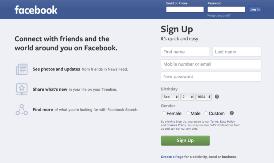
Check out how Facebook allows users to sign up with the bare minimum information. Later, it encourages users to fill in their personal information.
Remember, users do not want to fill forms that have too many fields. By asking what’s necessary you are reducing the cognitive load on them and increasing the chances of completion.
b. Improve Form Readability
No one wants to fill a cluttered form. It’s not just an eyesore but also negatively impacts user experience. Make sure all the input fields are properly spaced in one column. This improves the readability and increases the chances of the form being filled correctly and submitted.
Forms with multiple columns are proven to confuse users. They are proven to interrupt the user’s vertical momentum of moving along the form.
Also, make sure the information you need is placed sequentially.


c. Begin with Easy Questions
Avoid beginning with complex questions, else it may increase the risk of abandonment. Begin with simple questions so that the users are encouraged to answer them. This will also make them more committed to answering complex questions later.
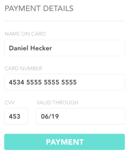
For instance, it isn’t a good idea to begin your form by asking for the user’s credit card details. Most visitors may be uncomfortable sharing it.
2. Boost Form Usability
The usability of a form relates to the user’s ability to navigate through it without any problems or distractions. Here are a few pointers to consider.
- For the date of birth, use a single date selector, not multiple drop-down menus.
- Avoid multiple action buttons as they may distract the user from their current task (filling the form).
- Avoid vague CTAs like ‘Click here.’ Instead, state the actions. For instance, ‘Send me weekly offers’ or ‘Create my account’ are specific CTAs.
- Make sure there are large click areas and intuitive spaces in the form area where users know they can click without any issue.
- For password fields, add a ‘Show Password’ option. This will save users from retyping the password in a signup form and check for mismatching passwords.
- Fast-loading forms and pages are the foundation of website usability. People engage with forms when they can move freely and focus on the content instead of waiting for it to load.
Hence, it’s wise to invest in WordPress page speed optimization to boost your form’s usability and UX.
The web form on your website should be easy to use, allowing the user to fill in the required details with minimum challenges.
3. Pay Extra Attention to the Label Design
A label helps create a caption for the input fields in the form. Here are a few points to pay attention to when creating effective labels.
a. Label Position
Form labels are best placed above an input field. That way users aren’t forced to look at the labels and the input fields separately.
For bigger screens, the labels can be placed to the left of the input fields, right-aligned. This allows the labels to be close to the input field, helping users to easily relate to the fields.
b. Label Proximity
Always leave ample space between two input fields. This will make the layout look neat and prevent user confusion related to input fields.
c. Inline Form Labels Have Specific Use
A few websites require developers to use inline labels, located in the field. Though these labels save space and make the page look neat, they disappear once the user adds information. So, avoid using them all the time.
Inline labels are a good choice when you have a few fields like user name and password fields.
4. Use Default Values with Care
Default values in forms are usually employed to minimize the user’s effort in filling multiple fields and boost user experience. However, a lot of user research goes into offering default values.
People using forms using default values do not spend too much time verifying the data added in the fields. So, an incorrect entry could cause a lot of mess.
For instance, imagine a situation where a user is booking an online travel ticket. If the form pre-populates incorrect information from another source and it doesn’t match the user’s ID proof, it could lead to several issues.
5. Don’t Miss Out on Making the Form Accessible
Every website developer owes it to their audience to make the website accessible to all the abilities. The Web Content Accessibility Guidelines (WCAG) developed through the W3C process, lays certain guidelines to make web content more accessible to people with disabilities. Make sure you refer to these guidelines when designing forms.
Also, pay attention to these pointers when designing an accessible form.
a. Check the Contrast
People with visual disabilities find it tough to read the text if there isn’t enough contrast between the text and the background. Provide sufficient contrast between the form’s foreground and background.
b. Let Users Control the Text Size
Individuals with poor vision and cognitive impairment need the font sizes to be large. Hence, it’s wise to allow users to incrementally increase or decrease the text size according to their comfort level.
c. Enable Screen Reader
A majority of people with disabilities and the aging population use screen readers to help them make sense of the web content. For improving your form’s web accessibility, include the label attribute for screen readers and section your form for two different topics. Also, tag the groups for screen readers.
d. Don’t Solely Rely on Color for Communicating Status
Colors like red, blue, or green are commonly used to communicate status online. However, people with color blindness may need additional identification.
An estimated 8% of males and 1% of females are colorblind. So, by relying only on colors to communicate status you are missing out on a considerable section of the global population.
Filling out a form isn’t something that most people enjoy doing; hence, your role as a website designer or developer is to make this task as easy as possible.
6. Offer Feedback after Form Submission
Once the user has submitted the form, share feedback. For instance, a message like ‘Your information is successfully submitted!’ or ‘Email address/ phone number not valid,’ will help users understand whether their efforts of filling the form were successful or not.
Here are a few pointers to bear in mind.
- Display inline error messages and highlight them with contrasting colors.
- Avoid blaming the user. For instance, saying ‘You did not enter a valid zip code,’ can be replaced with ‘Please enter a valid zip code.’
- The error message should be clear and concise. Plainly saying ‘Something’s not right!’ will not help. Instead, give a clear error message like ‘The email address is invalid’ or ‘Please add @ in the email address.’
7. Know Your Form Plugins
As mentioned before, WordPress offers tons of plugins (over 60,000) that make it easy to add features and functionality to websites.
However, not all plugins are created equal. Besides evaluating them based on their functionality, it’s important to look at their security, how recently they’ve been updated, the number of active installations, and other factors. This simple exercise will help you choose an ideal plugin for the job.
For instance, a plugin that’s up-to-date and has several active installations indicates that it enjoys wide community adoption and a dedicated team behind it.
Bonus Tip: Handle Form Abandonment Smartly!
Form abandonment refers to when a user begins to fill the form but leaves the page before submitting it. Capturing this set of visitors should ideally be a critical part of a firm’s conversion optimization strategy as 81% of people abandon forms during the process of filling it.
People who encounter frustration when filling out forms are unlikely to give you a second chance. Therefore, it’s insanely important to pay attention to and take measures to reduce the form of abandonment.
1. Capture the Partial Entries
One of the most effortless ways to get people to complete the form submission is to get in touch with the ones who partially filled it. Use WordPress plugins like Nicereply, Form Abandonment Tracking and Form Abandonment Addon to collect information on such entries.
Once that’s done, it’s time to follow up with the interested prospects and encourage them to finish the form. You can also set up an automated form abandonment email to remind them to revisit the form.
That brings me to the next point.
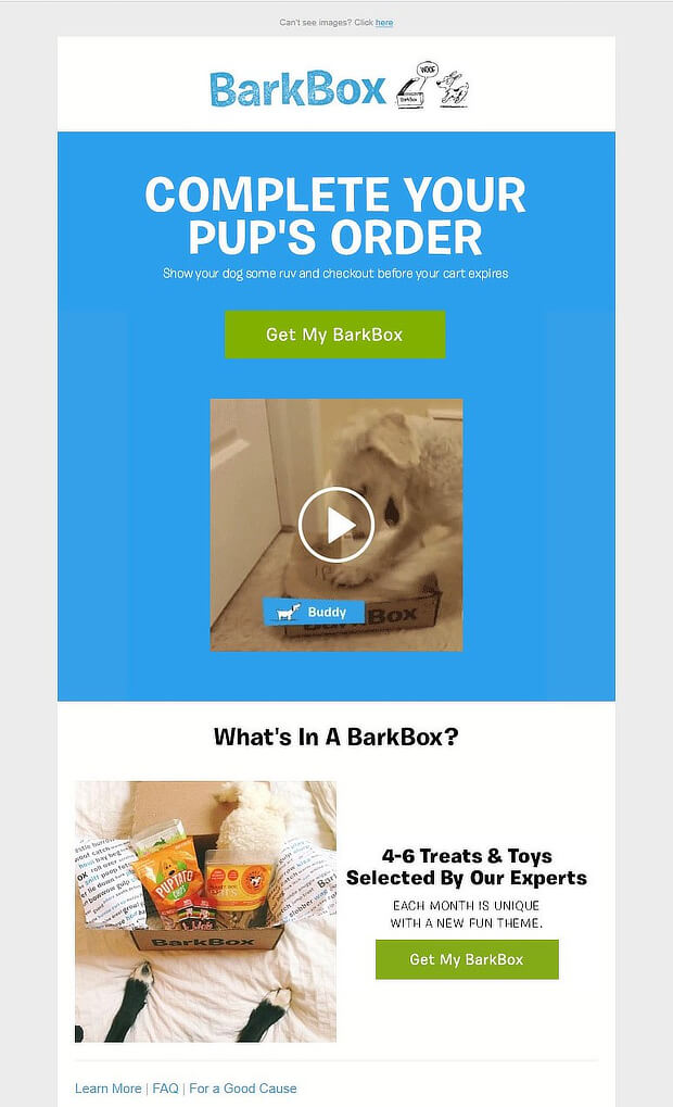
2. Leverage Retargeting Emails
These personalized emails attempt to remind and convince the prospect or customer to return to the form and complete it. This can be done by gamifying the message, offering an incentive to the user, or building a sense of urgency.
Check out how a few top brands leverage retargeting emails.
The Virgin Group

BarkBox
Dollar Shave Club

3. Test Your Forms
Every business is unique and so is its audience. Hence, there’s no guaranteed tactic for a better form conversion. That’s why it’s important to A/B test your forms.
Use WordPress A/B testing plugins and tools like OptiMonster, Simple Page Tester, and Nelio A/B Testing to manage and keep track of the A/B tests on your WordPress website forms.
4. Count on Lead Generation Platforms
Online forms play a big role in a firm’s lead generation strategy. No business can ignore the importance of having forms that create a positive and painless experience for their visitors.
Hence, it’s wise to count on a few tools that can help you attract visitors and convert them into leads. Woorise, for instance, is an all-in-one lead generation platform that allows businesses to create engaging forms, interactive campaigns like contests and giveaways.
Such tools can help you generate more traffic and leads and engage them effectively.
Summing Up
Building and maintaining a WordPress website is quite an exciting journey, especially because the popular CMS has loads of plugins to make life easy for developers and webmasters.
It also offers several plugins for creating awesome web forms. However, depending on plugins alone will not help. A web developer needs to be aware of the do’s and don’ts when creating an effective website form.
Use the tips and tactics shared in this post to create a form that will improve usability and encourage users to submit it successfully.
About Author:
Lucy is a creative content writer and strategist at Marketing Digest. She specializes in writing about digital marketing, technology, entrepreneurship, and education. When she is not writing or editing, she spends time reading books, cooking, and traveling.